Project
Nordstrom - Design Challenge
This was a design challenge that was assigned to me during one of my interviews for a company. The prompt of the challenge was to choose a retail mobile website experience (section, screen, flow, etc) that I like the idea of/ think is useful for a customer but for which the design could be improved. I chose Nordstrom because it is a retail app that I frequently shop on. I combed through the app and put on the eyes of a customer to see what could be improved about the app. I had 2 hours to complete this challenge.
Role
Product Designer
Problem Statement
I’m someone who has a hard time figuring out what items to buy because I am not sure how I can piece together the pieces and most of the time, I don’t even know where to start when I am shopping. With the increasing usage of social media, people are always sharing their outfits inspiration and most retail companies are adopting this into their shopping experience for customers. Fashion companies have started adding an Instagram section where they will showcase outfits with links to the specific items worn in the picture.
Since Nordstrom is a big fashion company, it’s not surprising that they also have this section in their app. But one problem that I identified was how they displayed and made use of this section. The app only shows 4 outfits at a time and when you click the “See More” button, it just refreshes the feed to another 4 outfits. After a couple clicks, it would cycle through to the same outfits. This isn’t very helpful when you want to see a variety of different outfits.
What is the current section right now?
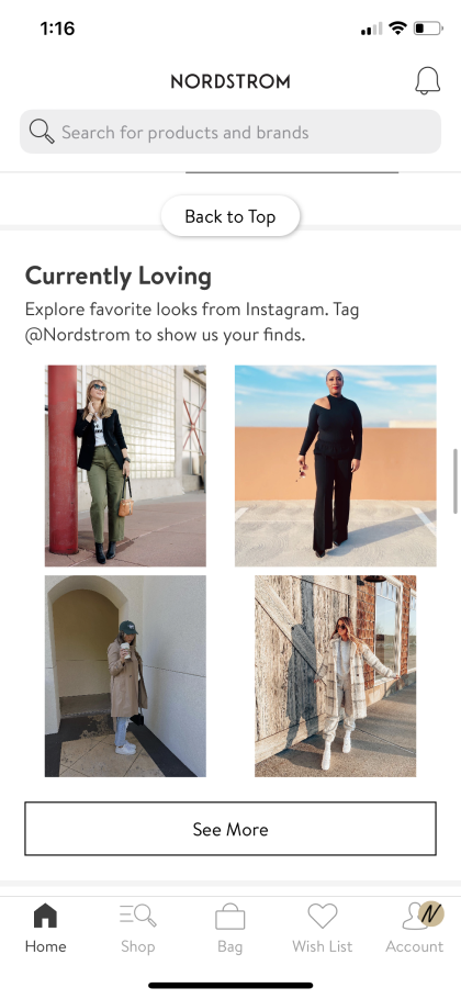
This is the Instagram feed that you can access from the homepage

This is what happens when you press the “See More” feed. After a couple clicks, the feed refreshes to the same outfits

When I click on one of the images, I would expect to see a bigger version of the picture, but I don’t. It just takes me to the item details.
SWOT Analysis
With the time crunch of the project and lack of user interviews, I did a quick SWOT analysis on different e-commerce mobile app that has an Instagram feed feature

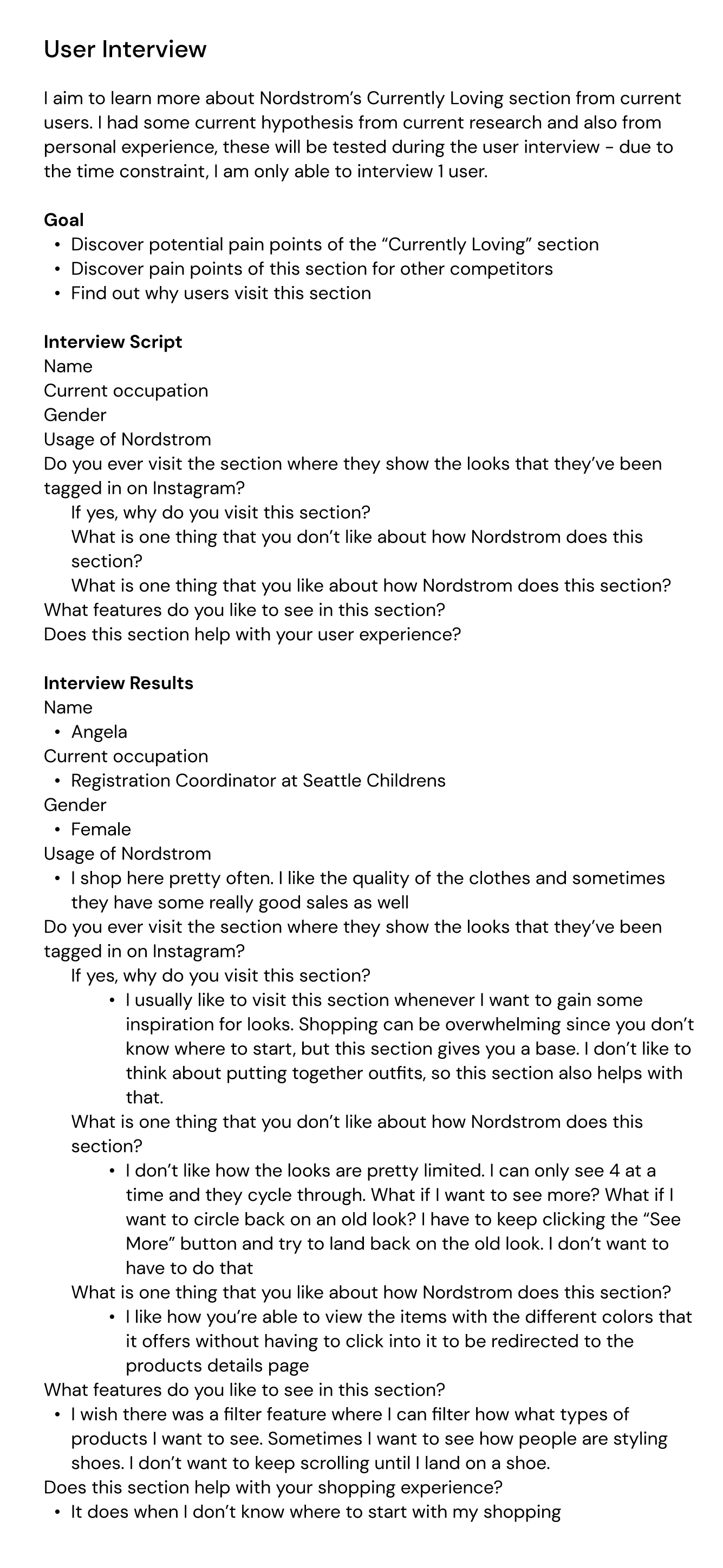
User Interviews
I wanted to conduct at least one interview - with someone who uses the Nordstrom app. This way, I could ask them open ended questions of why they look at this section.
This interview confirmed that I wasn’t the only one who feels this way towards the current Instagram feed.
So what is the actual problem?
After doing some quick research I identified that the problem is:
Users are not able to fully view the looks and they have to keep pressing the see more button in order to return to an old look
So how can we redesign this section so that users are having a better experience with this?
Who exactly are these users?
Since there are so many different types of users, with the research I did online and the user interview, I decided to narrow down to one user. I wanted to understand the context of who this person is, their pain points, and their needs and wants.
This is: Ashley

She is a 25 year old female who works as a software engineer at a tech company. She is occupied with her work and doesn’t have time to look around for clothes so she tends to look for clothes inspirations instead and buys similar items.
Pain Points:
Tired from working
Doesn’t know where to start with shopping, but wants to elevate her closet
Needs/Wants:
Easy shopping experience
Easy and clear IG shopping feature
Wants there to be a filter option so that she can narrow down what category she wants to look at
What should the user journey look like?
Ashley opens up the Nordstrom app and scrolls down to the “Currently Loving” section because it’s almost summer so she wants to shop for new summer outfits
She clicks on the “See More” button to view more look
She clicks on “Filters” and clicks on shorts
She scrolls through the feed and clicks on look that she thinks is really cute\
She is shown all of the items that are shown in that picture, really likes the shorts so she clicks on it to see more about it. She adds it to her cart
She goes back to the feed and remembered that she liked a look a while back and now she wants to buy it
She clicks on the sort and then selects “Favorites”
The look pops up and now she’s able to add it to her cart
After the end of this experience, Ashley is pleased with how easy and quick it was to go shopping for a couple outfits
Old app flow vs new app flow
The left side is the old app flow and the right side is the new app flow

Sketches
Now that I have a good idea on the new flow, I roughly skecthed out the new main flows.


Lo-Fi Wireframes
After the initial sketches, I jumped into Figma to create some quick wireframes of the new screens.


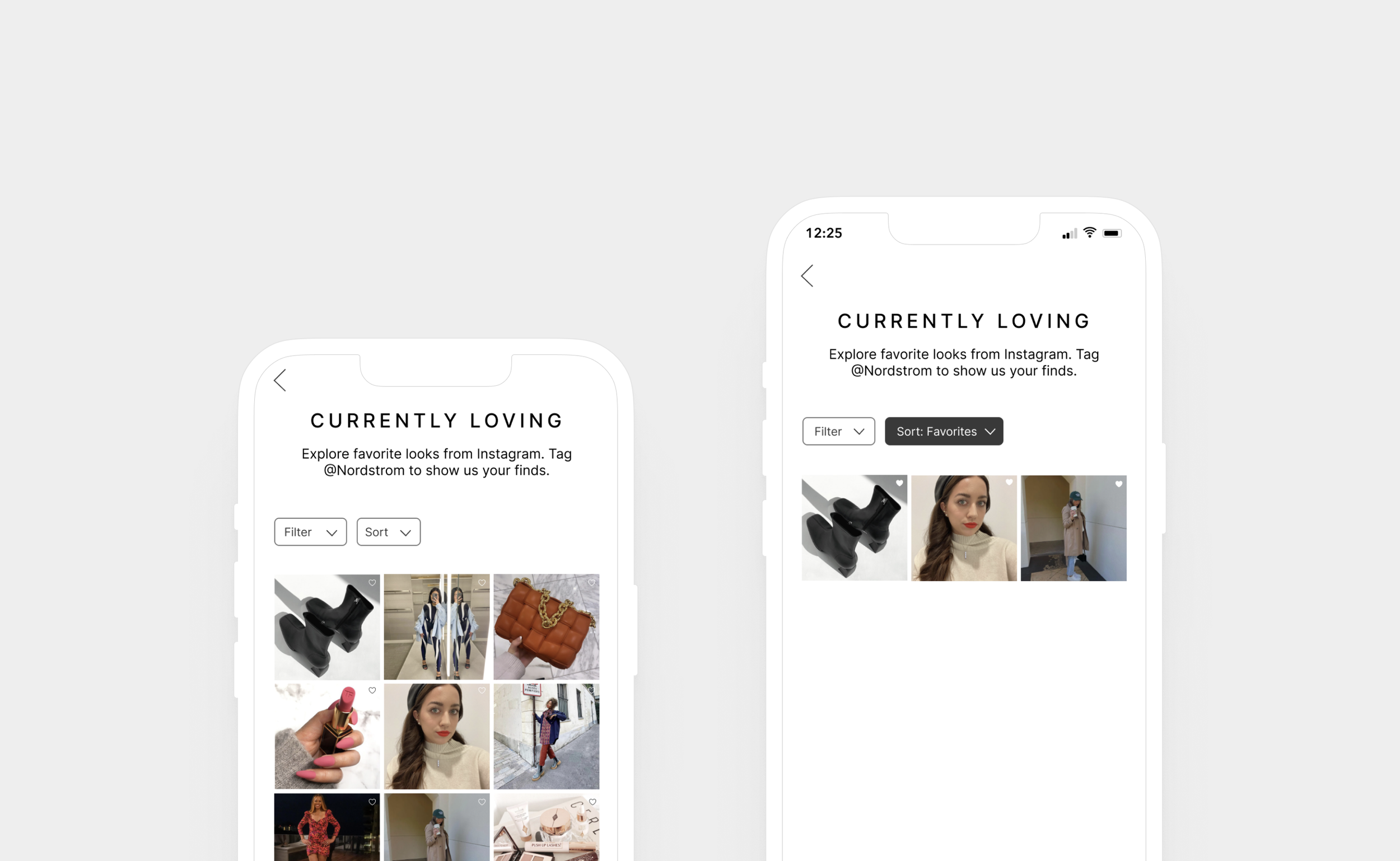
Final Designs

01/04
This is what the page will look like when users click on an image on the homepage. It will show a picture version of the image, who posted it, and the item details page

02/04
This is what the users will see when the click on the “See More” button. It will show more images. When users click on the “See More” button one more time, the feed will add more images while keeping the current images

03/04
Users are able to favorite a look that they like but clicking on the heart icon on the top right corner of an image. They then can filter out those pictures by using the sort feature

04/04
Users are able filter out certain categories that they want to look at. They can do this by using the filter feature